 by
by Last Updated on November 7, 2025 by Avia
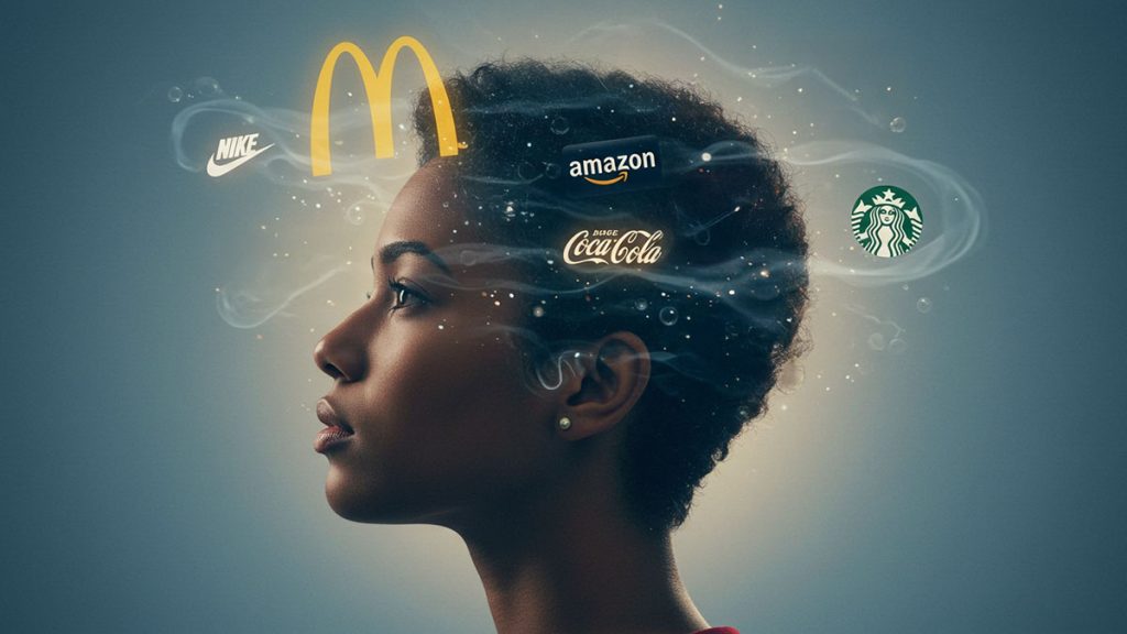
If you buy anything, you know brands. They’re everywhere, and they’re formidable in the choices we make. From soup to soap, we all know brands. We’ve even grown up with some logos, making them ingrained in our consciousness. But what is the meaning of the hidden language of brand logos? We’ve got answers.
Table of Contents
- 1. Seeing Logos as Living Energy
- 2. How Symbols Speak to Your Subconscious
- 3. The Energy Behind Color and Form
- 4. Reading the Intention in Famous Logos
- 5. Creating Alignment Between Energy and Message
- 6. Extending Brand Energy Into Business Processes and Systems
- 7. Managed IT as an Extension of Brand Intention
- 8. Merging Spirit With Structure
- 9. Honoring Cultural and Collective Meaning
- 10. Let Your Logo Become a Reflection of Your Light
- 11. Closing Thought: Intention Is Everything
- The Last Word on Brand Logo Meanings
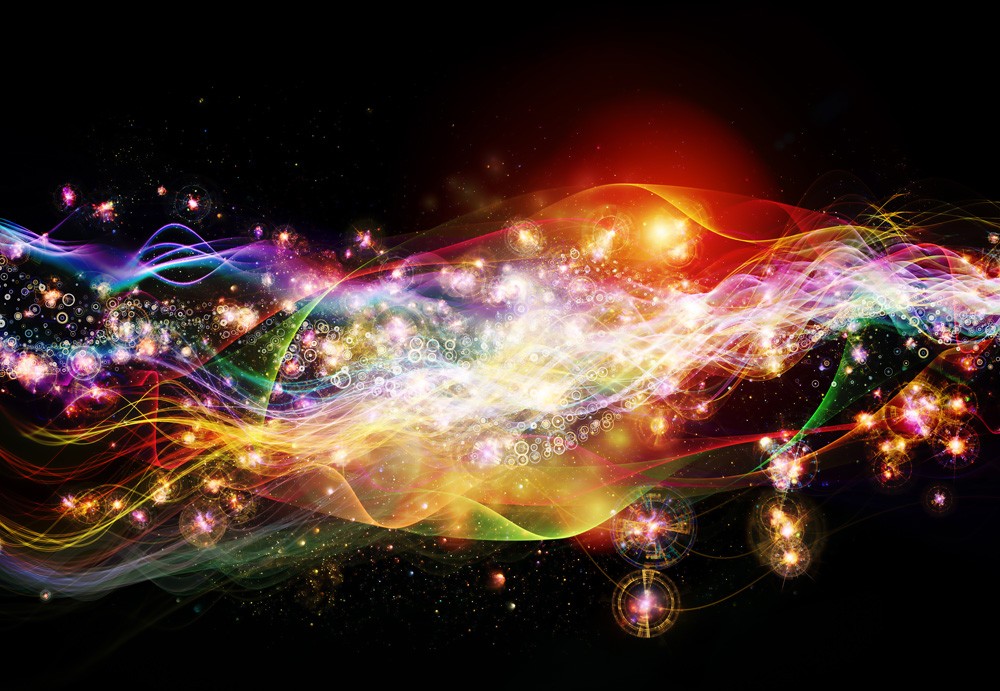
1. Seeing Logos as Living Energy
When you look at a brand logo, you’re not just seeing design, you’re witnessing energy in motion. Every shape, line, and color radiates intention. It’s how a company silently shares its spirit with the world.
You may not realize it, but your eyes and intuition already read these signals. A circle may feel calm. A triangle may stir motivation. The more you tune into this hidden language, the more you’ll understand what a logo is really saying, not just to your mind, but to your energy.
2. How Symbols Speak to Your Subconscious
Symbols have been guiding humans since the dawn of time. They carry vibration, emotional, and spiritual frequencies that communicate without words. When you connect with a logo, you’re responding to these subtle cues.
- Circles feel whole and infinite, reminding you of cycles and connection.
- Triangles awaken focus, movement, and higher thought.
- Curves and waves soothe the senses, inviting creativity and a sense of flow.
You can think of these as energetic signatures. Every brand chooses symbols that mirror its deeper purpose, and every viewer feels that intent on an intuitive level.
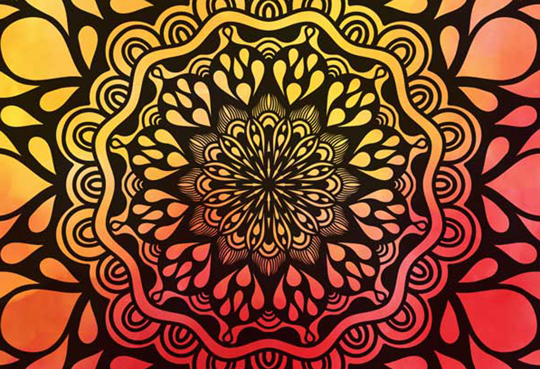
3. The Energy Behind Color and Form
Color, like shape, holds frequency. It’s light translated into emotion. When used wisely, it brings harmony between what a brand means and how it feels.
- Red calls you into action. It speaks of passion and courage.
- Blue invites calm and trust, grounding you in stability.
- Yellow radiates joy and curiosity, sparking creativity and inspiration.
- Black and white create balance, the yin and yang of simplicity and strength.
When you combine color and form with clear intent, the energy becomes magnetic. It’s how brands attract the right people and those who resonate with their vibration.
4. Reading the Intention in Famous Logos
When you start to see logos as spiritual tools, patterns appear everywhere. Every well-known brand has chosen its design to reflect an inner truth.
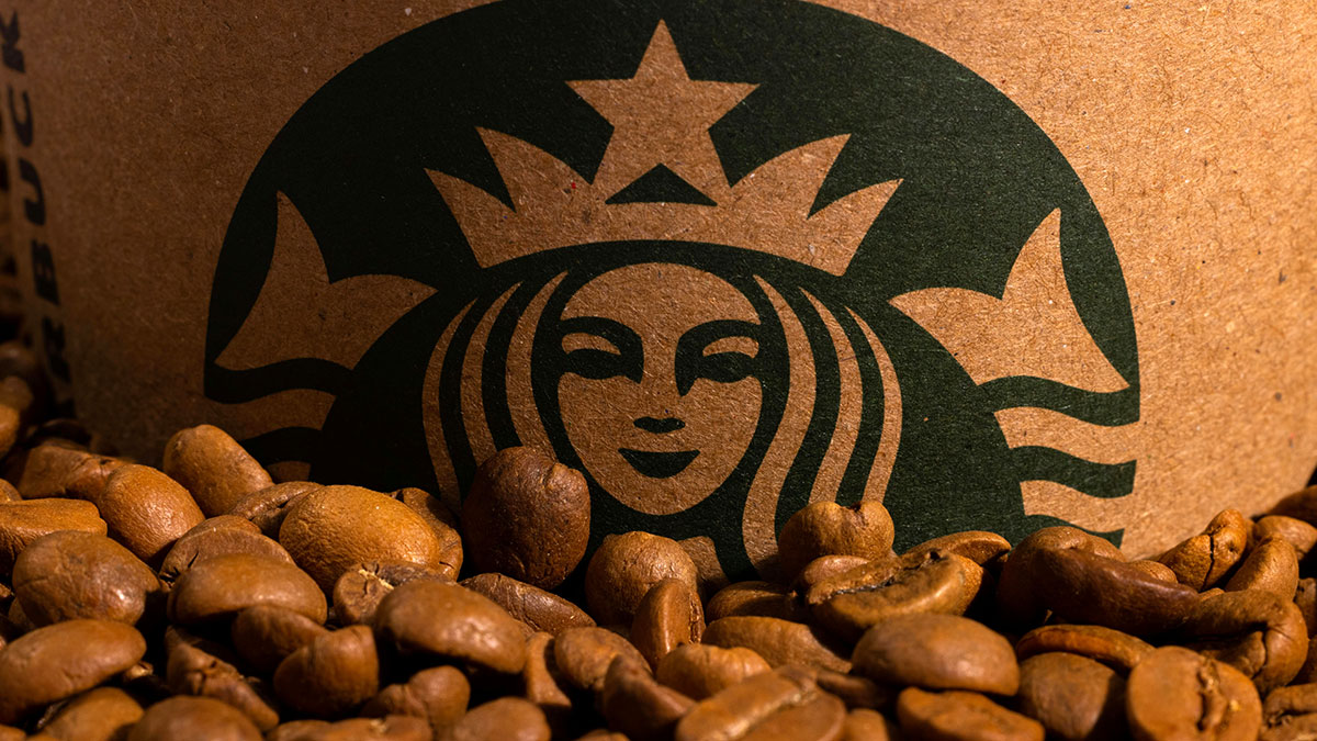
- Apple’s apple reminds you to seek knowledge and explore new ideas.
- FedEx’s arrow speaks of precision and forward motion.
- Nike’s swoosh embodies flow, victory, and belief in momentum.
Each of these designs carries intent. The simplicity helps you feel their message instantly (confidence, progress, and purpose) without a single word spoken.
5. Creating Alignment Between Energy and Message
If you’re creating a brand or refreshing an existing one, start by tapping into your core energy. Ask yourself:
- What does your brand feel like when it’s at its best?
- Is your energy bold and active, or calm and supportive?
- What do you want people to sense (not just see) when they meet your logo?
When you align design with energy, you don’t have to shout your message. It resonates naturally. Shapes and colors become your spiritual allies, carrying your story out into the world.
6. Extending Brand Energy Into Business Processes and Systems
A logo’s energy doesn’t stop at the surface. It flows into how you work, your systems, your service, and your daily rhythm. When your inner operations carry the same vibration as your visual identity, everything aligns.
You might notice that the companies you admire don’t just look balanced; they run that way too. Their internal processes reflect their brand energy: smooth, responsive, and intentional. This harmony between appearance and operation is where authenticity truly lives.
Think of your business processes as the heartbeat that powers your brand. Every workflow, from client communication to IT support, sends energy out into the world. If your systems feel disorganized or disconnected, your audience will sense it, even if they can’t explain why. When your inner workings are calm, structured, and consistent, your brand’s energy becomes magnetic.
7. Managed IT as an Extension of Brand Intention
Technology is one of the most powerful energy channels your business uses daily. Managed IT isn’t just about efficiency; it’s about alignment. When your tech systems flow smoothly, your creative energy stays clear.
In fact, for businesses seeking this kind of operational clarity, Truis company offers managed IT support services in Melbourne that help align your systems with your brand’s intention. These services ensure your infrastructure operates in harmony with the energy your brand wants to project.
A thoughtfully managed IT environment supports your brand’s higher purpose. It allows your team to focus on inspired work instead of constant troubleshooting. It creates space for clarity, innovation, and connection, all of which your logo may already symbolize.
Imagine your digital ecosystem as the energetic foundation beneath your brand’s visual identity. A well-maintained network reflects reliability. Secure systems project trust. Responsive IT support mirrors compassion and care. Every digital detail echoes the vibration your logo sets in motion.
8. Merging Spirit With Structure
It’s easy to think of branding as purely creative and business systems as purely technical, but when you weave them together, your brand evolves into something whole.
- Your logo speaks to your energy.
- Your processes carry it forward.
- Your managed IT systems protect and amplify it.
This connection turns your business into a living expression of its own intention: consistent, reliable, and alive with purpose.

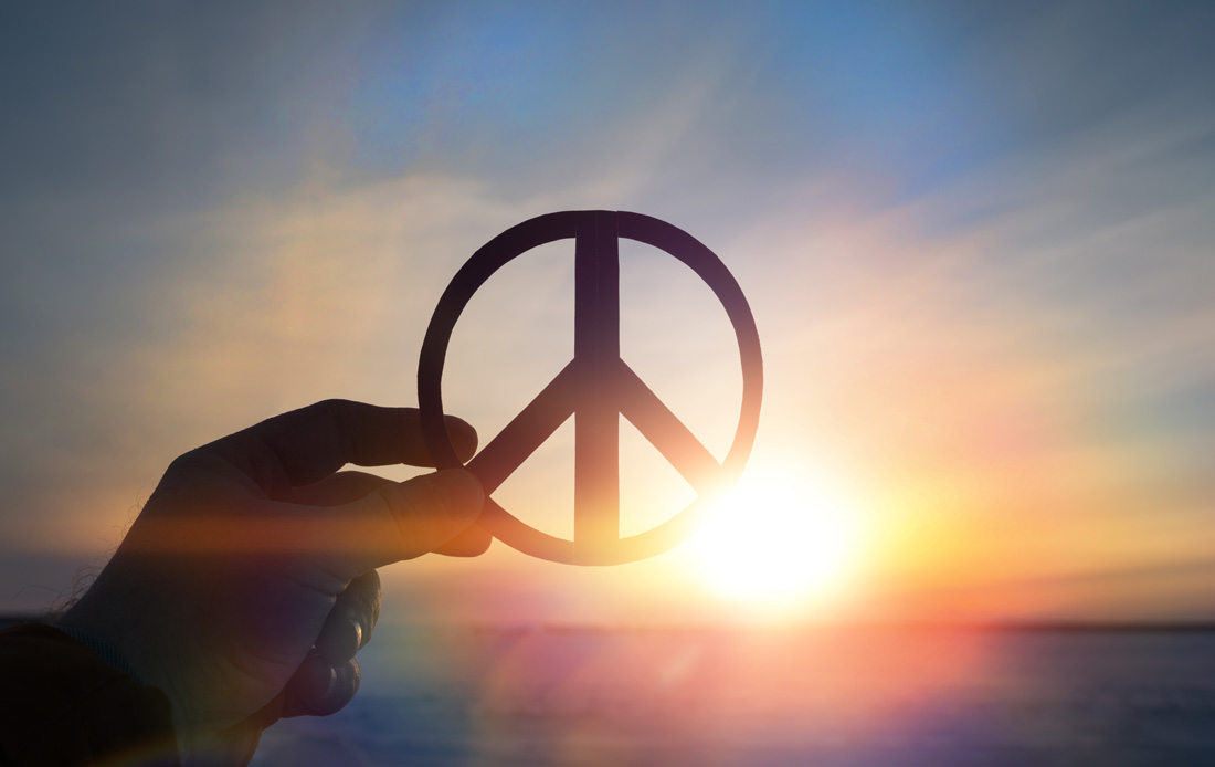
9. Honoring Cultural and Collective Meaning
Every symbol speaks differently depending on where it travels. What feels empowering in one culture may mean something else in another.
Take time to learn how your chosen imagery is understood around the world. A lotus may symbolize rebirth, a dragon might represent strength, or a moon may whisper intuition. When you choose consciously, your logo honors not just your brand, but the collective energy of those it touches.
10. Let Your Logo Become a Reflection of Your Light
A logo is more than an image. It’s a reflection of your brand’s inner light. It tells your audience who you are, not just through design, but through your energy and presence.
When people connect with your logo, they’re aligning with your energy. That’s why it matters that your design feels true. You want it to radiate authenticity, clarity, and balance, all qualities that naturally draw others in.
11. Closing Thought: Intention Is Everything
When you view branding as energy work, everything changes. You begin to design not just with color or form, but with consciousness. You infuse meaning into every choice, and your audience feels it.
The Last Word on Brand Logo Meanings
Your logo becomes more than a symbol. It becomes a message, a mirror, and a magnet. It carries your energy into the world, quietly affirming what you stand for.
So when you next look at a brand mark (whether your own or another’s), pause. Feel what it’s saying. The language of symbols is ancient and subtle, but when you listen closely, it always speaks of intent.
Want more? Me too! That’s why I’ve also got this for you on Whats-Your-Sign:
The feature image in this article is provided courtesy of Engin Akyurt